Data Cleaning & AI

Setting the Stage

In the digital age, data is being generated at an unprecedented scale. Estimates show that in 2025, over 180 zettabytes of data will be generated worldwide, an increase of over ten times compared to figures in 2015. From transaction records and sensor data to social media interactions and academic journals, a tidal wave of information is upon us. Unfortunately, the scale of this data can be more overwhelming than enlightening if it is not dealt with correctly. While more data promises better informed decisions and more powerful artificial intelligence (AI), it can also confuse us, cause inefficiencies, and breed bias. These days, it is imperative not to focus on how much data is flowing around but to rather ask, what data is relevant? More importantly, who and what defines relevance?

We are at a turning point of data, we can either let it control us or take steps to maintain control over it. AI models trained on a plethora of human generated data have the opportunity to change

In the age of big data, what is relevant and how does that influence AI models tested on this data? Additionally, what are the benefits and disadvantages of “clean” data? What social and cultural implications do these have?

The Importance of Relevant Data

How Data is Cleaned

From this link… https://cs.brown.edu/courses/cs227/archives/2017/papers/data-cleaning-IEEE.pdf#page=5 scrape together a paragraph that highlights the conclusion sections of each article and provides examples of how data is cleaned

Should Data Always be Clean?

How AI Reacts to Bad Data

Cultural Implications

Final Thoughts

Mapping With Datawrapper

Datawrapper is a tool created by more than 20 people, led by David Kokkelink as the CEO, Mirko Lorenz as the chairman of the board and co-founder, and Gregor Aisch as the CTO.

The Datawrapper mapping tool was created by a team of more than 20 people including key figures such as David Kokkelink, Mirko Lorenz, and Gregor Aisch, as described by the Datwrapper website. The mapping tool has a comprehensive free plan, but offers premium custom and enterprise plans that are suitable for professional work. The paid plans provide more flexibility and features than the free plan. The software for the tool is not open-source and seems to be completely built in a proprietary fashion. 

To use the Datawrapper mapping tool for free, you simply navigate on a browser to the website and can begin creating maps immediately. The website does not even need individual users to sign in, though it is not immediately clear if a user without an account is restricted to any extent. Once you have chosen a region of the world to map from the website’s extensive list of places, it asks that you upload data in the form of a CSV or Excel file. These files need to be in a format that contains three columns for address/place, longitude, and latitude, respectively. Yet, if you don’t have one of these files ready or need to add locations after, you can simply type in an address or location and the website will add it to your data.

After uploading your data, you have various options regarding changing the look and feel of your map. In the “Visualize” tab there are a few different symbols you can use to represent places on your map. Additionally, there are tools you can use to provide the intended audience with information about the data and what the map aims to show. Further information about the tool can be found in Datwrapper’s documentation guide that is found on the same website.

Digital Essay Plans

Before my digital essay meeting I was a bit concerned that it would be tough to flesh out the idea of “data cleaning” into a comprehensive digital essay. I planned to explore the ways people and organizations implement data cleaning techniques on datasets in the modern day. Browsing for relevant sources online, it became clear that the most useful information appeared in highly technical research papers. Seeing as I want to display information about data cleaning in a way that is understandable and interesting to the average reader, I have to abstract some of the information in these papers. Professor Abdoney mentioned that creating a timeline of data cleaning processes/techniques could facilitate a way to present this information in both an engaging and informative manner. This timeline will be my focus moving forward and it seems to be the clearest way of analyzing the significance of data cleaning up to the present. The focus of this digital essay is still subject to change (especially if the breadth of my timeline is not sufficient enough), however, for now this seems to be the best course of action. I plan to scour the web for a blend of technical and general overviews of the different processes of data cleaning over as long of a time period as possible. Ideally, I will be able to analyze how approaches have modernized to handle today’s era of “big data” and explain the motivation behind data cleaning as a whole. Hopefully, I will be able to tell a story that provides insight into the development of data cleaning techniques and their relevance given the time period. Furthermore, I would especially like to highlight the advantages and disadvantages of “clean” data. Does “messy” data get overlooked and do we lose relevant understanding of data sets when cleaning them?

Annotated Bibliography

Branscombe, Mary. “When Is Data Too Clean to Be Useful for Enterprise AI? | CIO.” Accessed February 18, 2025. https://www.cio.com/article/3611247/when-is-data-too-clean-to-be-useful-for-enterprise-ai.html.

  • This article explains why AI tools need access to rich and substantial data sets rather than ultra-refined ones. This article is relevant to the new AI boom and how data cleaning can negatively affect its development if certain measures aren’t considered.

Foote, Keith D. “The Impact of Poor Data Quality (and How to Fix It).” DATAVERSITY, March 1, 2024. https://www.dataversity.net/the-impact-of-poor-data-quality-and-how-to-fix-it/.

  • This articles presents the needs for high quality data in the business world and defines this data and how to collect it. I would like to explore how unrelated industries might be making decisions based on high quality data or how a lack of it could contribute to failures.

Gilbert, David. “Google, Microsoft, and Perplexity Are Promoting Scientific Racism in Search Results.” Wired. Accessed February 18, 2025. https://www.wired.com/story/google-microsoft-perplexity-scientific-racism-search-results-ai/.

  • This article highlights a realized danger of providing AI with data that is false yet prevalent, it adapts to what it is given without considering the results. I would love to learn how companies have approached this issue and want to learn more about the spread of misinformation due to bad data.

Hosseinzadeh, Mehdi & Azhir, Elham & Ahmed, Omed & Ghafour, Marwan & Ahmed, Sarkar & Rahmani, Amir & Vo, Bay. (2021). Data cleansing mechanisms and approaches for big data analytics: a systematic study. Journal of Ambient Intelligence and Humanized Computing. 14. 1-13. 10.1007/s12652-021-03590-2.  https://www.researchgate.net/publication/356292133_Data_cleansing_mechanisms_and_approaches_for_big_data_analytics_a_systematic_study.

  • Comprehensive review of state-of-the-art mechanisms for big data analytics that highlights repairing and analyzing uncertainty within data sets. I want to cover the the main ways companies with massive data flux handle their data.

Moss, Aaron. “Too Important to Get It Wrong: The Consequences and Embarrassment of Bad Data Quality.” CloudResearch, September 15, 2022. https://www.cloudresearch.com/resources/blog/the-consequences-of-bad-data-quality/.

  • Highlights issues with the CDC’s initial response to the COVID19 outbreak and how their bad data influenced poor decisions. I don’t know if I will find much value in this article, I might have to branch upstream using some of its embedded links.

Rahm, Erhard & Do, Hong. (2000). Data Cleaning: Problems and Current Approaches. IEEE Data Eng. Bull.. 23. 3-13.

  • Describes data cleaning with very diverse data sets and how there needs to be justification for making changes to data. Another great source of data cleaning techniques and most specific journal article I have found.

Van den Broeck, Jan, Solveig Argeseanu Cunningham, Roger Eeckels, and Kobus Herbst. “Data Cleaning: Detecting, Diagnosing, and Editing Data Abnormalities.” PLoS Medicine 2, no. 10 (October 2005): e267. https://doi.org/10.1371/journal.pmed.0020267.

  • Describes the process it takes to clean data in the modern age along with a nice view of the historical context needed to understand where it originates. In depth resource that provides better context when reading about less scholarly resources.

A Look Into The Stars

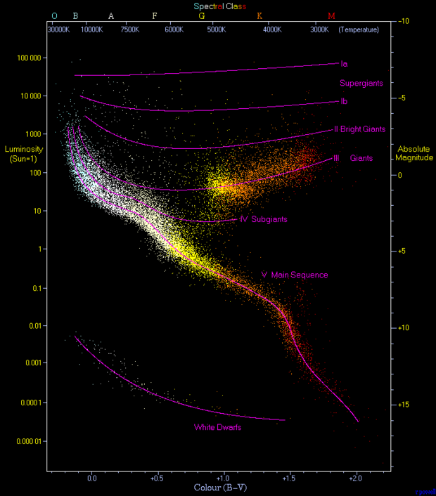
This data visualization shows a scatter plot of about 23,000 stars gathered from the Hipparcos and Gliese catalogs, populated with a list of stars from astrological surveys. The graph above displays these stars on a scatter plot that compares their color (surface temperature) to the luminosity (energy emitted per second). Opposite to these measurements appear spectral class and absolute magnitude scales which are proportional and other key measurements astronomers use to compare stars.  To someone with deep astronomical knowledge, I think this visualization still displays a clear pattern among star types. The longest fitted curve corresponds to the main sequence, where the highest concentration of data, which stars tend to move upwards then branch off to one of the “giant” curves then sometimes burn up and fall back to the dwarf curve. Together, this is supposed to convey how the mentioned characteristics of stars relate to and describe the process of stellar evolution.

The graph succeeds as a data visualization tool because it combines color-coding (blue to red reflecting the actual observable colors) with a vertical luminosity scale. The axes make it easier for viewers to see correlations. The labeled purple curves aren’t visually conflicting and reinforce the idea that different parts of the plot correspond to different stellar categories. For novice astronomers (the likely intended audience), this helps convince them that there are strong relationships between the temperature and brightness of stars. The style suits the data because it is simple but also visually engaging. Without the visualization, a paper describing this phenomenon would be much less understandable and would likely leave most people confused about the correlations.

This graph is often referred to as a  “Hertzsprung–Russell Diagram” and is the main image on its Wikipedia page. I wasn’t able to find the exact source of this graph various types of these graphs are usually found in articles from physics journals and university lecture slides. The original data sets come from the European Space Agency’s Hipparcos mission and the Gliese catalog of nearby stars. These sets are likely stored in plain-text or CSV formats and can be accessed through astronomical databases like SIMBAD and the Digitized Sky Survey (DSS).

Searching for Clothing with AI

If I created an AI app, I would develop an algorithm that helps people find and buy clothes for their wardrobe. While this idea is probably less “impactful” on the world than some other ideas out there, it could help more people dress the way they want within their budget range. To begin using it, users would have the option of documenting their current wardrobes and how much they wear specific items for the algorithm to start at a baseline. If the user does not want to use this feature they can always supply more keywords and themes for the app to work with.  Additionally, users would be able to specify their needs in a new wardrobe. For example, the algorithm would know to consider whether the user plans to wear clothes for comfort or style and what type of climate they usually dress for along with numerous other options that could help the algorithm curate a more individualized clothing selection. Theoretically, the more specific inputs the user gives the algorithm, the better equipped this app will be to provide the right choice of styles and items the user is looking for.

Once a user prompts the AI to provide a clothing selection depending on their preferences, the app will generate a short list of possible styles and pieces that align with their needs. The AI will use data scraped from clothing websites online and use data from reviews online to point customers to local shops as well. If the user is not content with the initial results, they can further tailor their queries to hopefully meet their desires. In terms of revenue, this app will take minor fees associated with online purchases made through the help of the app and possibly will have to rely on some ad revenue to maintain it. To avoid harm, we will never require a user to submit personal information and if they choose to, it will remain confidential. Additionally, to avoid bias we will have a strict policy for collecting data that our algorithm runs on to best support the wide array of clothiers the app points customers to.

Brainstorming a Project Topic

For my project topic, I want to focus on a topic related to data science. Specifically, I find issues related to collecting, cleaning, and archiving data to be the most interesting consequences of the age of big data. With the incomprehensible amount of data being introduced into our networks at any given second, I want to know how humans are attacking these problems and what technologies are being leveraged. We need new ways to extract insight from datasets that highlight the relevant content.

As a physics and math major, I enjoy thinking analytically and find modern data problems extremely interesting. Quality data plays a crucial role not only in business and technology but also in scientific research, which I am more familiar with. This past summer, I worked on a research project that focused on improving an algorithm for gravitational wave source detection. It was fascinating to learn how current state-of-the-art facilities like LIGO wrestle with a constant stream of data coming from space and can extract valuable results from the weak but elaborate signals of black hole and binary star mergers. My research team’s goal for the code was to improve its ability to sort through detector data so that gravitational wave signals could be isolated to a higher standard. This research experience made it clear that math supplies the theoretical foundation for organizing and analyzing data, while physics offers real-world applications that demand precision and accuracy of results.

I am not quite sure what to focus on regarding a specific topic related to data cleansing and organization. This area of data science is extremely relevant to what we have previously discussed about data archiving and AI emergence. There are many branches to explore, but I am leaning toward a more technical exploration of a related subject. For now, I will continue to brainstorm.

All About Me

Hey, I’m Phin. Homebase is New London, Connecticut but I’ve had the opportunity to call many places home over the past 21 years. Throughout my childhood, I grew up in eight different countries and attended ten different schools. Moving about every two years was hectic, but I wouldn’t trade my experiences for anything. Getting to know so many different people, communities, and cultures has made me who I am today. Also, it’s made me fall in love with food. I wish more people knew just how many flavors are out there! That’s why I’m always on the hunt for some good eats.

Some Foods You Need To Try

Food Description Country
Pupusas Corn or flour tortillas stuffed with combinations of cheese, beans, pork, chicken, or loroco El Salvador
Shkemeruli Fried chicken cooked in a thick garlic sauce base Georgia
Egg Hopper Bowl-shaped coconut and rice based crepe which is a great addition to curries Sri Lanka
Nasi Goreng Spiced fried rice best served with vegetables and eggs Indonesia

Unlike my diet, something had to stay constant during my journey and that was my love of basketball, specifically my allegiance to the Boston Celtics. Though they did just finally get over the hump to win a championship, when I became a fan back in the 2013 season, little did I know that there would be many seasons of heartbreak in the playoffs. Despite the superteam they have now, I will still be happy to watch the team play even if they never win another championship. Hey, at least we aren’t the Sixers right now. My favorite player since I started following the team has to be Avery Bradley. Legend. Here’s some more about Avery….

Avery Bradley Career Achievements

  • 2016 All-Defensive First Team
  • 2013 All-Defensive Second Team
  • Stats

I also have two cats and a dog, whom I love dearly. Their names are Rosie, Basil, and Cocoa. Here are what they look like with publicly available images from the internet!

Rosie and Basil Cocoa

W&L’s Internet Landscape

As I walk through campus, I often take for granted the endless connection I have to the internet. When I return home each day to my place off-campus I realize just how lucky I was to never worry about my connection during my first three years at W&L. The internet at school is built for the heavy traffic an undergraduate institution requires, while the Xfinity plan at home comes with a limited bandwidth. Before this year, I would never have an issue streaming a movie or playing video games without lag spikes, but when the house gets busy it’s an unfortunate fact I have to deal with. At school, I am very fortunate I rarely run into issues staying connected to the web.

Before this, I didn’t put much thought into how the internet is provided at school. Now, thinking about it more, it must be quite the project to make sure every campus building is a source of connection for the 2,500+ students, faculty, and staff at any given moment. Though I don’t have any evidence, my theory is that W&L hosts a dedicated network somewhere that is relatively centrally located and provides a massive amount of internet bandwidth to other places on campus through a system of fiber optic cables. I think the cables are probably connected underground to routers across the school that gain access to a relatively small portion of the larger bandwidth. In areas with less network demand, wireless extenders are placed accordingly to boost signals from other routers.

While trekking across campus, I believe I only saw wireless extenders. One of these extenders is usually placed in each room across campus, or in places like the library, spread out across the entire floor. Because the routers are a more crucial part of the internet on campus, I feel they are tucked away in safer areas, away from a lot of activity.

A Look Into My Online Life

When I look up myself online I can’t find much. I don’t find it surprising because I’ve never had a publicly available online presence. I’m sure more of my presence is hidden away in the corners of internet data, but who knows if it will ever be uncovered. I surely can’t find it with any query connected to my name.

Despite this, the total three hits I connected with in my search tell a story about me (with some context of course). The first link that pops up on Google when I look up my name points to a Facebook post from my high school. It contains a minute-long clip of my chapel talk, a speech given in front of the entire school, and a requirement for graduation during my senior year. In the clip, I reflect on my time in high school and my appreciation of the culture, communities, and people I had been exposed to up to that point in my life. The second link points you to a race list for a ski competition at Bryce Resort in Basye, Virginia. This only exists because my friends pushed me to compete in a downhill slalom ski race for W&L’s intramural skiing and snowboarding team to fill our available roster spots. In this competition, I placed dead last causing technical difficulties when I ripped up the entire timing system as I crossed the finish in an “unorthodox” manner. The race coincided with my first time on the slopes in five years, crossing the finish line was a big win in my book. Finally, the last thing you’ll probably find about me publicly online is my LinkedIn profile. This page is self-explanatory, however, you can probably find out more about me on my profile than anywhere else online. It highlights my past work experience, skills, and a relatively recent picture of myself. Though limited, these three links come together to tell a bigger story about myself than one might think.

In my search for more information about myself online, I had no luck. I tried to get as specific as possible with my queries, yet mostly found connections to fictional characters like Phineas from Phineas & Ferb. It’s hard to analyze the evolution of my online activity because my presence has been limited. In the future, at its present state, my publicly online information would not provide a lot for a historian to work with. It could be a start.